NATIVIA
Premium Dairy
Packaging Design
A clean and modern milk packaging concept designed to express natural freshness and premium quality.
_edited.jpg)
Project Overview
NATIVIA is a conceptual dairy brand created to express freshness, simplicity, and premium natural quality. The visual identity combines elegant typography, soft color tones, and a custom botanical pattern to create a calm and refined packaging system.
Visual Identity
The visual identity was designed to reflect softness, clarity, and premium natural quality. Elegant serif typography combined with a custom botanical pattern creates a calm and refined brand presence.
Logo

Pattern

Colour Palette
_edited.jpg)
Typography

Packaging System
The packaging system was designed to create consistency across different product types while allowing clear visual differentiation through color variations.


Packaging Variation - Premium Pattern Direction
A more decorative packaging direction was explored to enhance the premium character of the brand while maintaining clarity and readability.

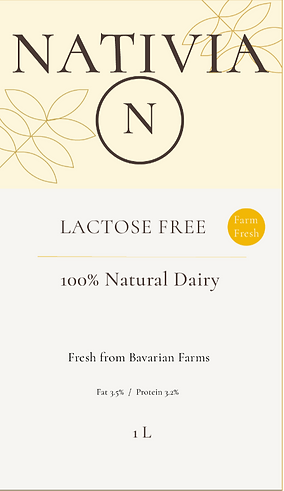
Back Lable System
Each product variant includes a structured back label designed for clarity, regulatory readiness, and brand consistency. The layout maintains a clean hierarchy while adapting nutritional and product-specific details for each milk type.

Packaging Mockups
_edited.jpg)
_edited.jpg)
_edited.jpg)
Final Brand Impression
_edited.jpg)
The NATIVIA packaging system was designed to communicate freshness, simplicity, and premium quality through a refined botanical pattern and a soft natural color palette.